MoodShift Identity
In 2013, after successfully designing their logo, I was approached by the Kaleidoscope Corporation to work on an project called MoodShift. It would be an iPhone app that aimed to enable the user to change his/her mood by using a
custom set of tools they had developed. For this project I was tasked with designing their logo (logotype and logomark), a passport icon, and a number of application screen design comps.

First Round
As I mentioned before, the purpose of the application was to allow the user to alter their mood by using the specialized toolset. When I started thinking about concepts for the logo, I found myself fixated on the idea of conveying the concept of 'change' and 'metamorphosis' and sought to figure out a way to show that in some abstract fashion. One of the first images I created consisted of two spheres, one being revealed inside of the other by the outer sphere's
separating hemispheres. I felt this implied emergence from within was a perfect fit for what the app aimed to do. In addition to this icon, I developed a pretty effective type treatment using two weights of the Nexa typeface in the wordmark to further represent a change. I ended up creating a couple of other ideas that I presented along with my initial concept.
Color Comps
The client was really impressed and excited with my 'metamorphosis' concept, so that was the iteration they picked. Surprisingly, they didn't request any revisions to this design, so I set forth exploring some color options for them to choose from based on some color choices the client had provided to me earlier in the project.
I started with a more comfortable pairing of green, orange, and blue. The second iteration also used orange and blue, but substituted a maroon instead of green. I kept the typography in a warm grey color.
Second Round
Unfortunately, it was at this point in the project that the client came back and asked me to start again from square one as they didn't feel like the direction we were going was right for the project. Not wanting to be restricted to any of the designs I had presented previously, they asked me to come up with something totally new. Their feedback included a preference that the icon be less abstract and resemble some kind of button that could be pressed to 'recharge one's
emotions'. As bummed as I was to scrap everything I had already completed, I could see their reasoning and did my best to go back to the drawing board. I presented them with the two options you see below. I had settled on the concept of using some kind of energy meter with a large central button that would contain some sort of symbol on it that represented 'energy'.
Color Comps
The client couldn't decide which of the two comps they liked best and instead asked me to create color comps of each one. They did state, however, that they preferred the lightning bolt icon. The first comp turned out looking a bit more
clean and contemporary than the second comp. For the energy meters I decided to use a gradient changing from green on the high end to red on the low end, showing the energy level rising. Again, I kept the wordmark in a warm grey.
Final Logo
The client ended up picking the first color comp and had some feedback that included simplifying the shape, making the button larger, losing the type on the bottom, and changing the energy meter to just a single color rather than three separate colors. After some discussion we settled on blue for the meter. I ended
up revising the wordmark to include the same blue from the meter as well as changing the temperature of the gray to a cooler one than I had been using previously. With the logo design completed, I moved onto some icon design.

Initial Comp
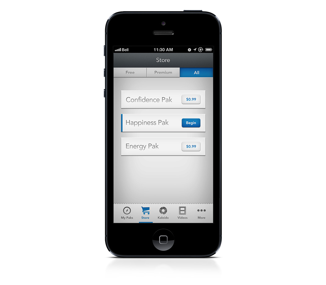
Within the MoodShift app, you could access and purchase different emotion packs or 'passports'. Therefore, the client thought it would be nice to have a passport icon to use in this section of the app. My initial idea was to do a skeumorphic passport icon that fit into the iOS app icon shape. However, it
became clear pretty quickly that this wasn't the right approach since these passports weren't a separate app. I settled with something a bit more realistic and fun, that had a lot of personality and detail.
Final Design
After seeing my initial comp, the client requested that we change the perspective of the icon so that the pages weren't so warped. So, here you have it...the final passport icon. I had a lot of fun designing this little guy. I always enjoy the time it takes to make something look somewhat photorealistic and diving into all the little
details. Fun fact: the portion of the map you see peeking out between the pages is a map of my neighborhood. With this icon completed, it was time to dive into the app screen comps.

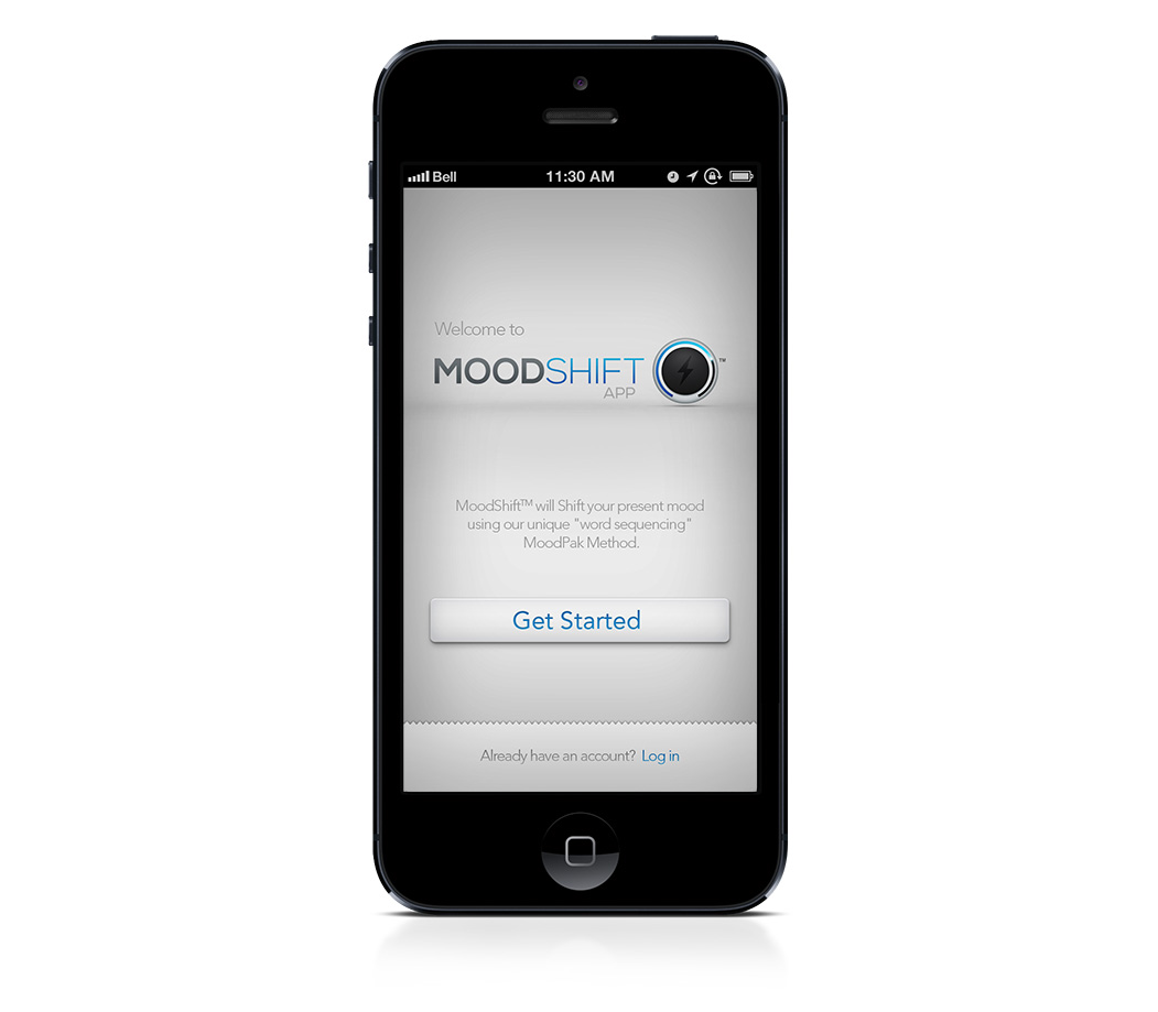
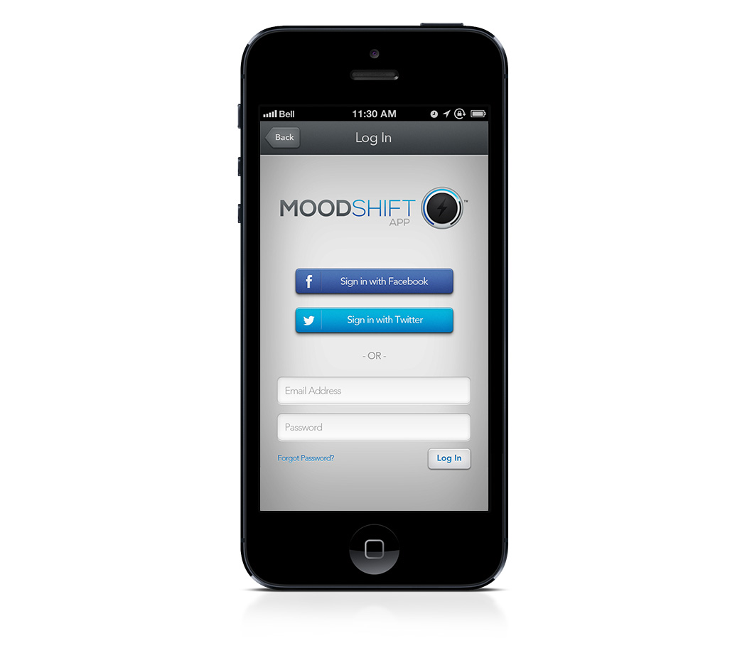
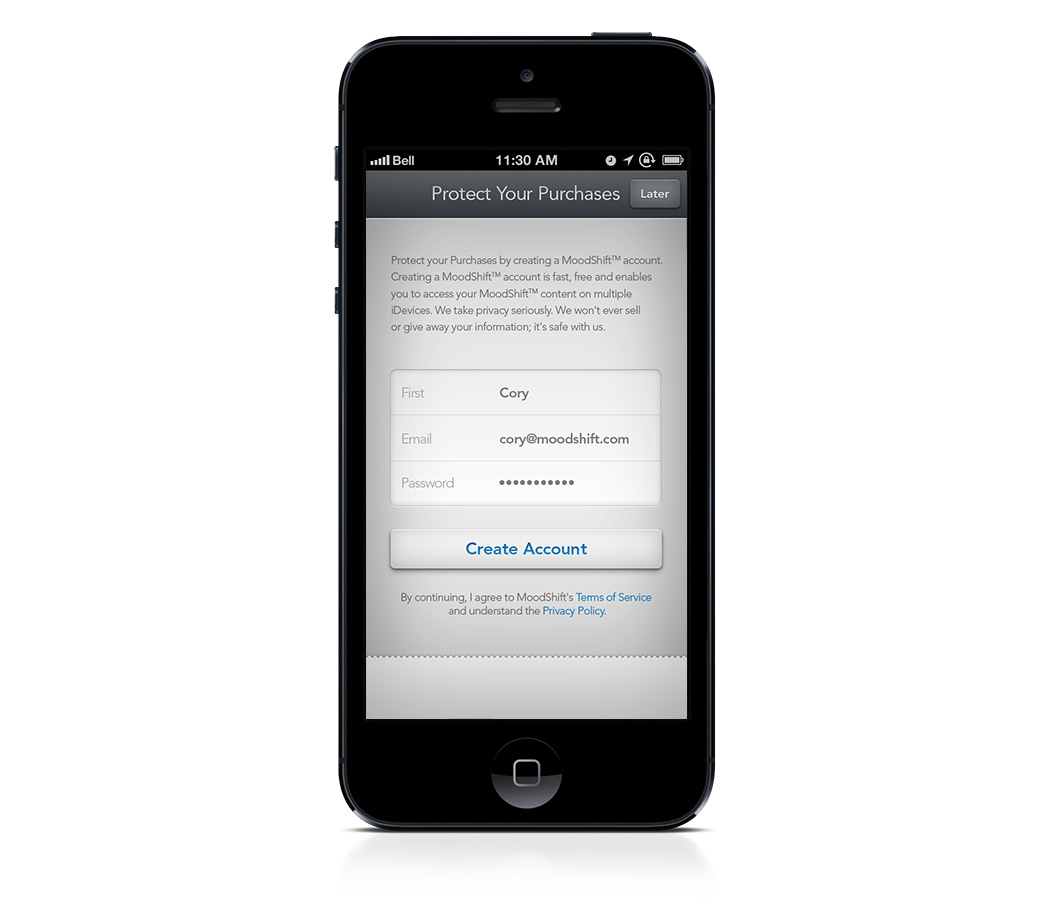
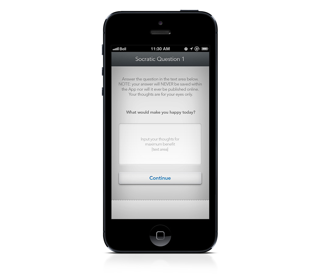
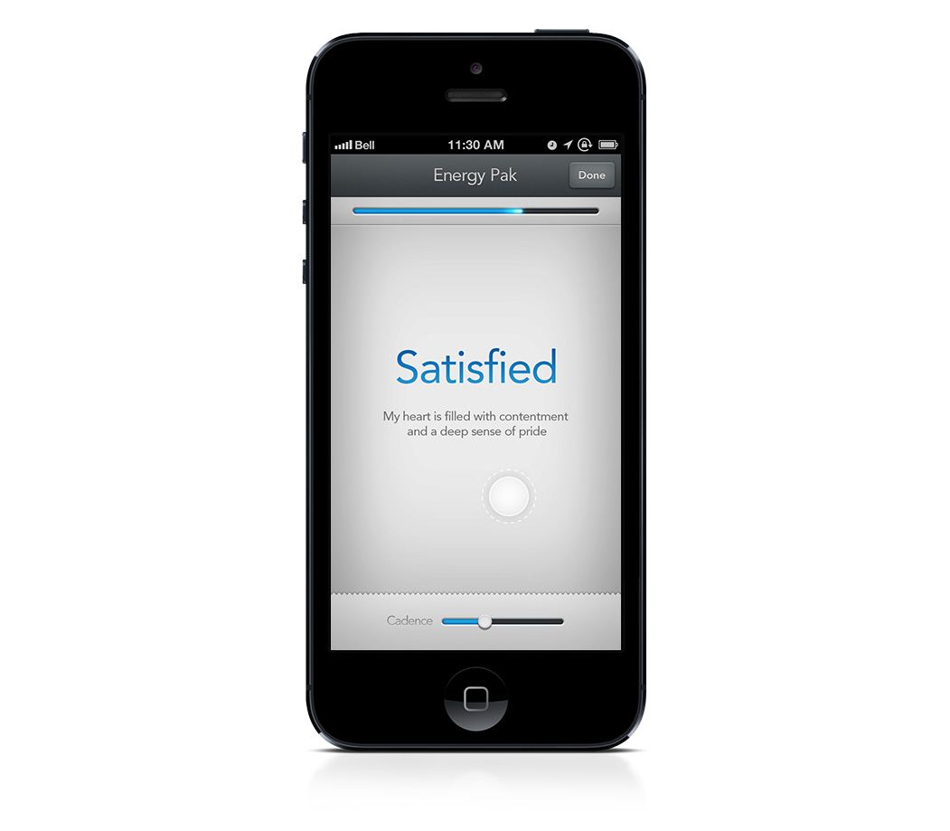
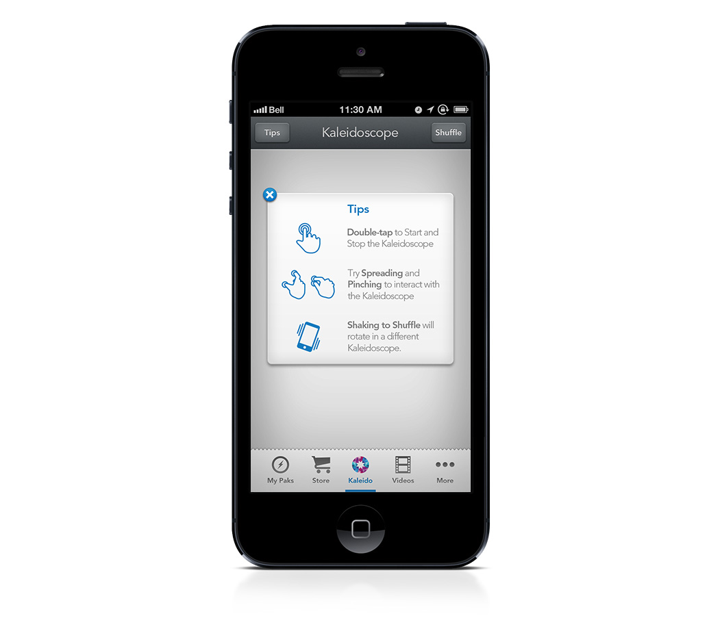
The client had provided to me a list of wireframes that they wanted to see comps for. Using the branding elements I had developed throughout the process of designing the logo and icon, I set forth designing something that felt cohesive and
unified. Unfortunately, my screen designs were never used, but some of the UI treatments were adapted for the final application that ended up being released. You can view my comps in the gallery below.